Heuristic Evaluation - Garrett Minster
Problem 1 Defined: The horizontal navigation tools on many of Fisher Price's pages are counter intuitive and inconsistent.
Problem 1 Explained: On many of the pages on Fisher Price's site, you will find a horizontal
bar showing a scrolling selection of products. Below the images, you will see a small red bar.
At first, I believed this was a scroll bar, like the one you use to scroll vertically on a page.
Upon closer inspection, it was a set of three small buttons you used to scroll vertically through the products.
These controls are not only counter intuitive, but also hard to see as the buttons are thinner than a standard mouse
cursor. Some of these red nav buttons are also paired with standard arrow buttons, creating inconsistency and confusion.
There is also a selection on Fisher Price's home page labeled, "Shop Fisher Price Brands" that features the
red nav button, but it is completely non-functional, as the list is not long enough to scroll through.
Problem 1 Location: This problem is located in multiple locations on Fisher Price's home screen
including the "Shop by Category", "Shop Fisher Price Brands", and the "Buy Fisher Price Playsets" subsections.
It is also located on all product pages on the site under the "You may also like" subsection.
Problem 1 Heuristics Violated: 4 - Consistency & Standards, 7 - Flexibility & Efficiency of Use
Problem 1 Heuristics Severity: 2 - Minor Usability Problem
Problem 2 Defined: The search filters menu is unclear and confusing.
Problem 2 Explained: When you shop under a subsection of products on Fisher Price's site, such
as "Baby Gear", "Toddler Toys" or "Thomas and Friends", you will be greeted by a search filters menu above
the products listed. Two of the options are easy to understand, type and age, but there are two other options
you will find as you go through the various subsections of products, milestone and theme. I assumed that
milestone was a filter specific to findings products themed to occasions like a baby's first word or a
birthday. The milestone subsection is more geared toward things a toy can teach your child like emotional
awareness, independence, and calming & soothing. The theme filter is similarly unclear and more geared
toward filtering the type of toy rather than a theme. There is also a "Show filters" button located next
to these options. From what I have seen, it does nothing. One last thing to note about the filters is that
if you go back to the previous page and return to a page where you used filters, the filters will not be
cleared. You must remove them manually.
Problem 2 Location: This problem is located on all of the various subsection pages you can shop under
on Fisher Price's website including but not limited to, "Baby Gear", "Fisher Price Baby Toys", "Toddler Toys",
"Fisher Price Shop by Age", "Thomas and Friends", "Little People", and "Power Wheels."
Problem 2 Heuristics Violated: 2 - Match Between System & Real World
Problem 3 Defined: Thumbnail images for products are not labelled consistently.
Problem 3 Explained: Like any other shopping site or website meant to showcase products, the products on
Fisher Price's website are linked through images of the products. Some of these thumbnail images have a circle
in the upper left corner showing what age group the product is aimed at. Examples of these thumbnails can be found
for the "Let's Try Tummy Time Play Kit", "Little People Christmas Wonderland Playset" and "Thomas & Friends Wooden
Railway Celebration Engines set." These age ratings are very helpful, as a user can tell before selecting a product
what the age range for the product is. Most of the thumbnails on Fisher Price's site, however, lack these thumbnail
ratings. This makes finding products under a specific age range more difficult than it should be, as the only other
way would be to use site filters. One other issue that stems from the lack of thumbnail ratings is that non-Fisher
Price toys on Mattel's website can appear in the "You may also Like" subsection on product pages. While viewing the
page for a stuffed otter intended for newborn babies, I was recommended a Barbie doll in the You may also Like
subsection which was intended for ages 3+ and included choking hazard accessories. This is not only a usability
problem, but also a safety hazard!
Problem 3 Location: This issue can be found across the thumbnail images for all Fisher Price and Mattel
products across Fisher Price's website and Mattel's website.
Problem 3 Heuristics Violated: 4 - Consistency & Standards, 10 - Help & Documentation
Problem 3 Heuristics Severity: 3 - Major Usability Problem
Problem 4 Defined: The Where to Buy menu is not as simple or user friendly as it could be.
Problem 4 Explained: On the page for every product on Fisher Price's website, there is a yellow, "Where to Buy"
button. When you select this button, you are greeted with two options for purchasing the product, "Find Online"
and "Locate Store." The Find Online option is simple enough. This option shows online retailers who carry the
product in question and allows the user to compare pricing. The results for online retailers are inconsistent
however, with only two random retailers being listed such as Amazon, Walmart, or Barnes & Noble. Also, Fisher
Price's online store is not listed. The Locate Store option meanwhile is less simple. The user must enter their
zip code into a Google Maps widget to find stores that carry the product in question. This option would have worked
much better if it used your browser's location settings so it could automatically locate stores for the user.
The Locate Store option also does not allow the user to compare pricing like the Find Online option, creating
inconsistency.
Problem 4 Location: This issue can be found under all products on Fisher Price and Mattel's website
under the "Where to Buy" button.
Problem 4 Heuristics Violated: 4 - Consistency & Standards, 7 - Flexibility & Efficiency
Problem 4 Heuristics Severity: 3 - Major Usability Problem
Problem 5 Defined: Fisher Price's website does not offer an alternate version of the site for
children or separate the main website from the store.
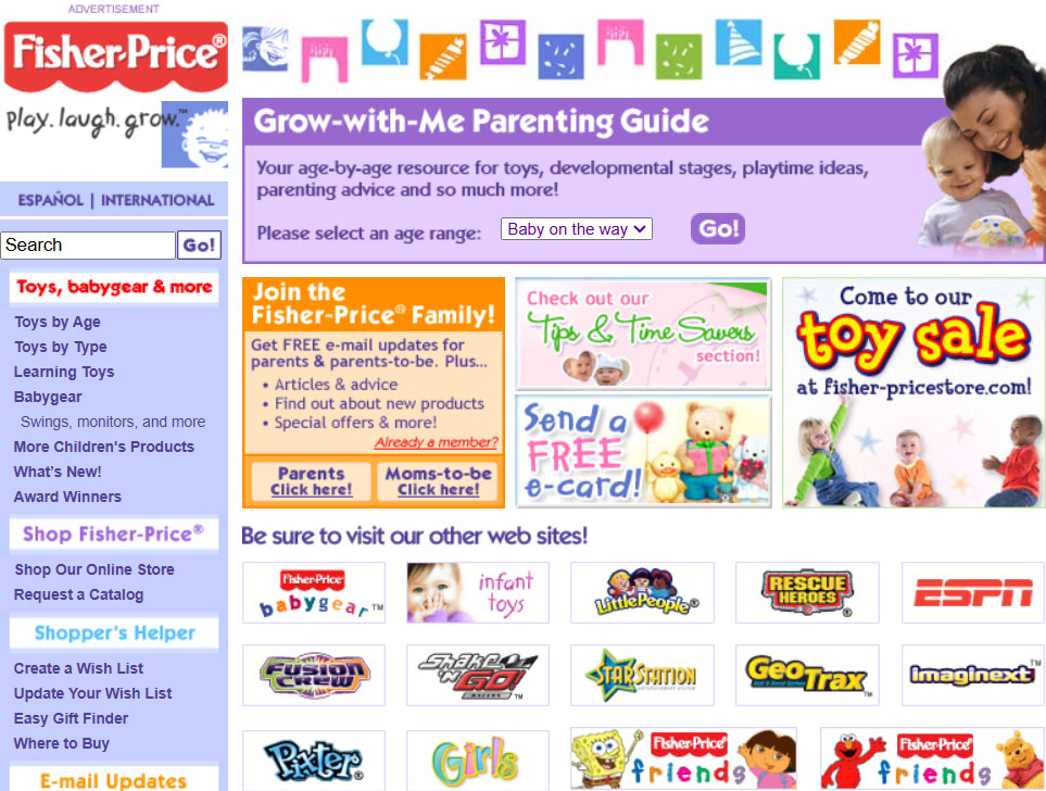
Problem 5 Explained: As discussed in my intro, I used to visit Fisher Price's website as a child.
I was less than ten years old at the time, but I knew how to use a computer, and I knew how to find websites for
things that I liked on the internet. Fisher Price's website at the time was mostly an interactive toy catalog with
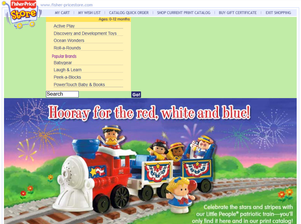
subsections dedicated to toy lines and age groups. There was also a clear divide between the main website and the
Fisher Price online store as the two were completely different sites at the time. This meant that I would never visit
the online store and accidentally get into trouble there. You can see screenshots of this version of Fisher Price's
website and online store in Figure 2.1 and 2.2. In the present day however, Fisher Price's website and online store
are one and the same. If a child were to visit Fisher Price's website today, they could easily get into trouble by
visiting a website where a parent's credit card information could be saved like Amazon or order something without
permission if one of the shopping sites Fisher Price recommends auto fills payment info. This could have been
prevented if a pop-up window appeared on the home screen or if you launched a specific page from a search engine
asking how old the visitor is. There also no "For Kids" section on the website despite having subsections under
"For Parents" and "For Collectors." This issue not only affects the youngest users of Fisher Price's website but
could also get Mattel in trouble with the federal government. Despite this website being centered around showcasing
children's toys, it is very likely that Fisher Price's website violates COPPA as the site could easily be viewed as
being intended for children under the age of 13.
Figure 2.1

Figure 2.2

Problem 5 Location: This issue could technically be found anywhere on Fisher Price's website but would be best located on Fisher Price's home screen.
Problem 5 Heuristics Violated: 5 - Error Prevention
Problem 5 Heuristics Severity: 4 - Usability Catastrophe